- UX Design
- UI Design
- A/B testing
- Developer handoff
Context
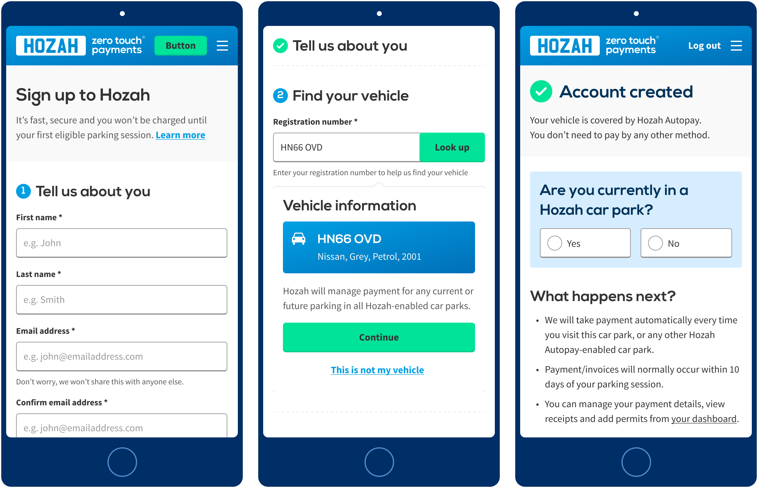
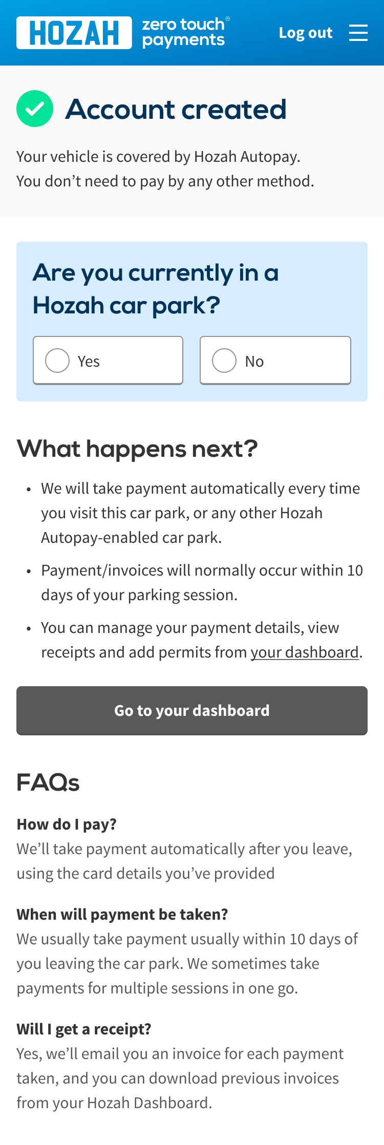
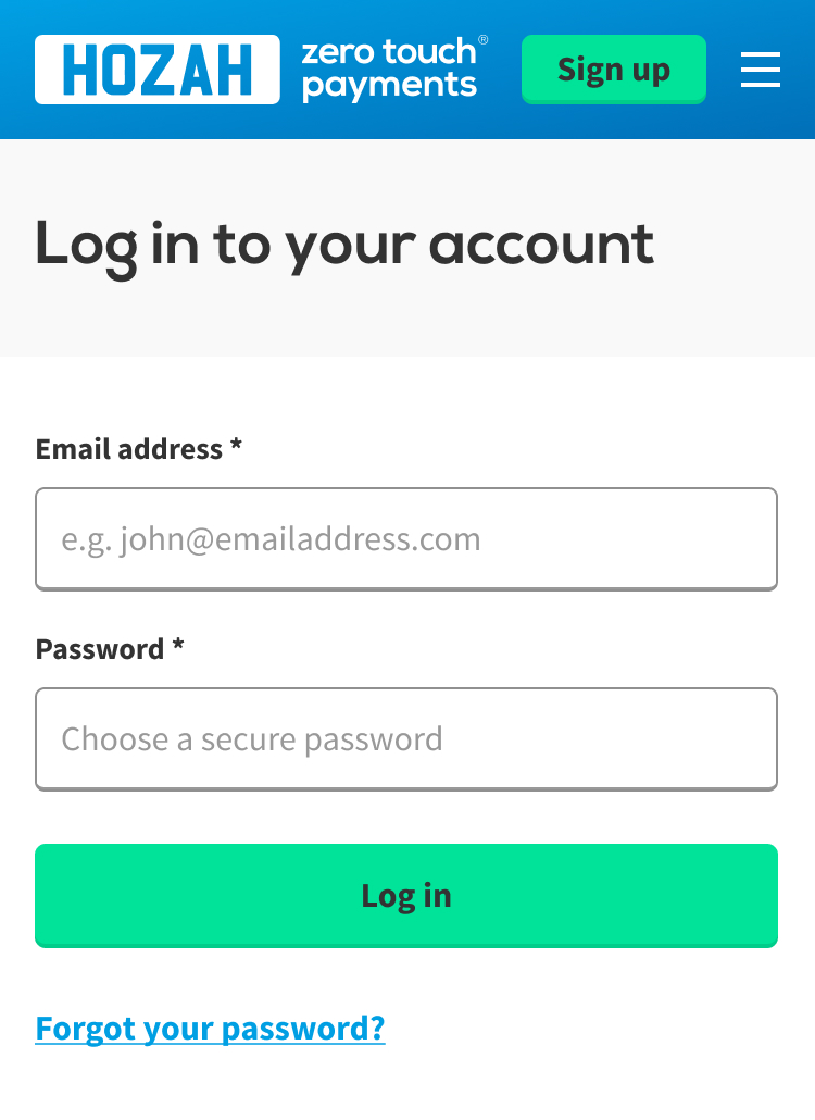
Hozah needed to refresh the sign up journey for their Autopay product - a service which allows users to pay for parking automatically. The existing journey was split over multiple payments, with inconsistent UI throughout.
Solution
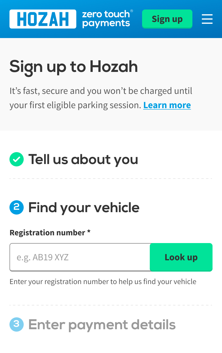
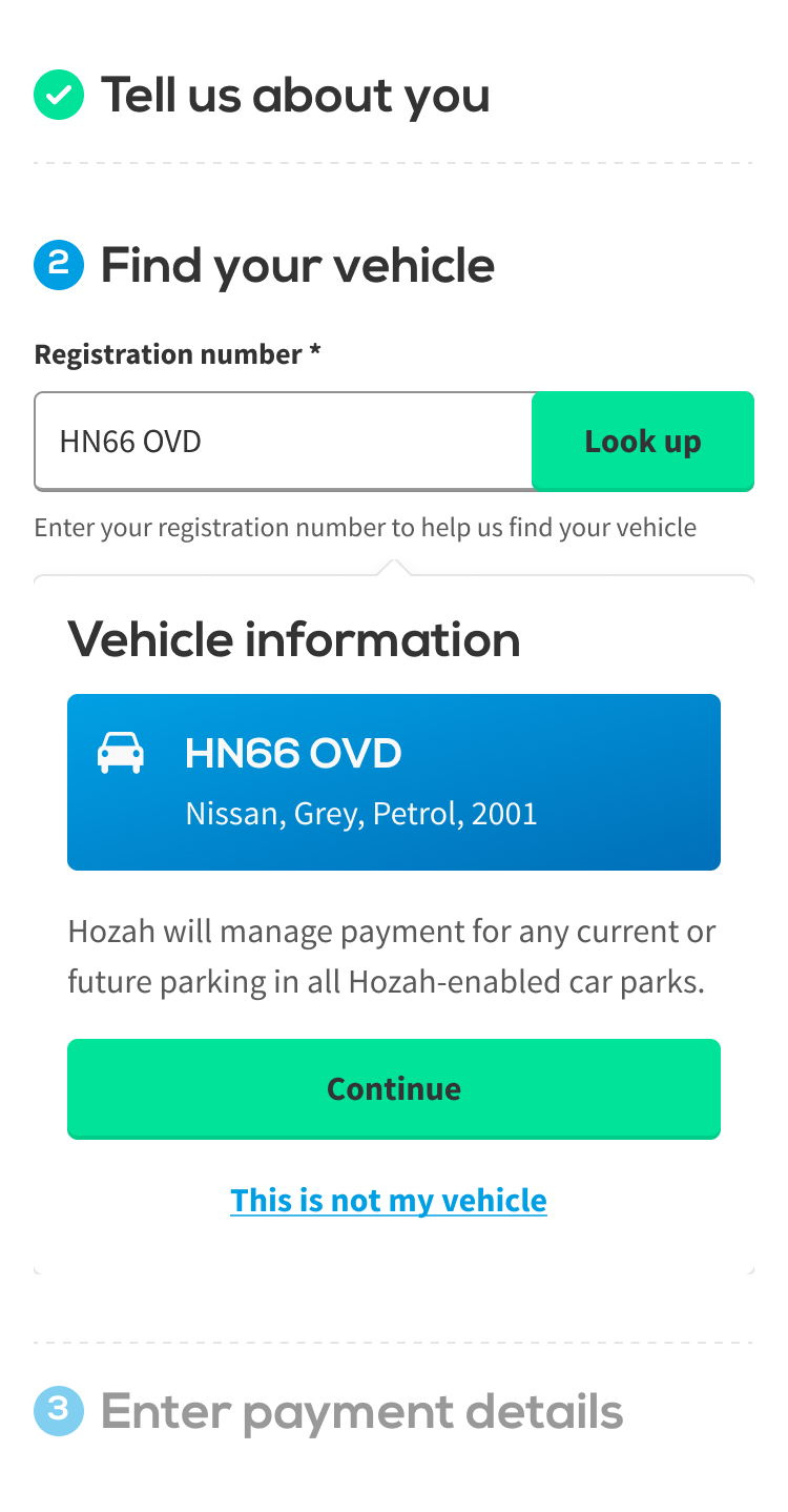
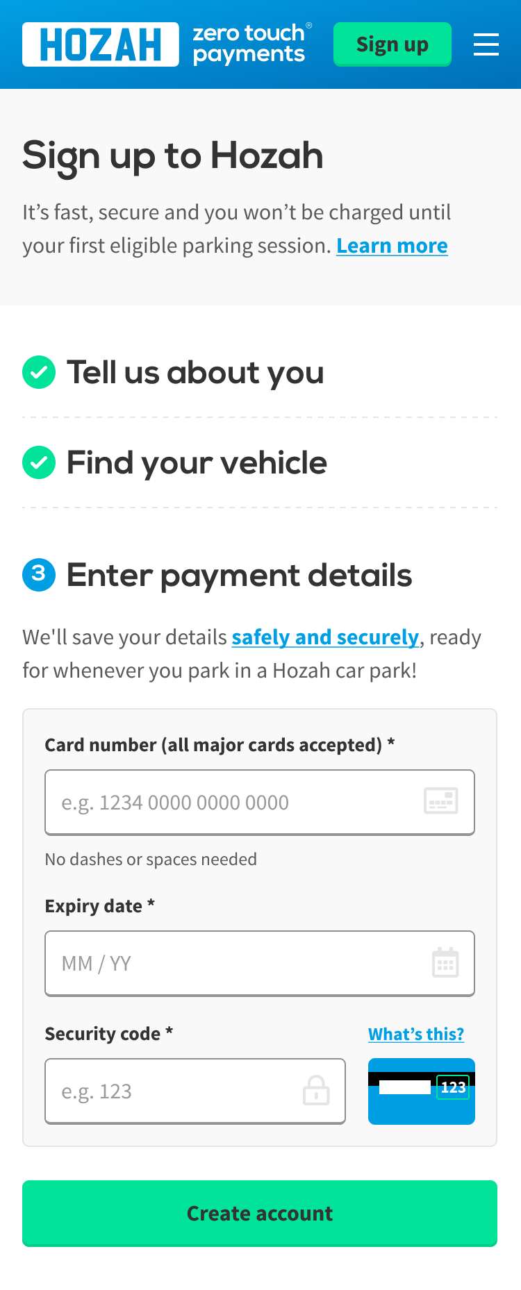
A much cleaner, simpler sign up process, which outperformed the previous version for conversion.
I moved from a multi-page journey to a single page journey, breaking into clear sections, with the hypothesis that users would feel the experience was quicker to complete.
See the final design