- UI Design
- I/A
- Accessibility
- Usability testing
- A/B testing
- Developer handoff
Context
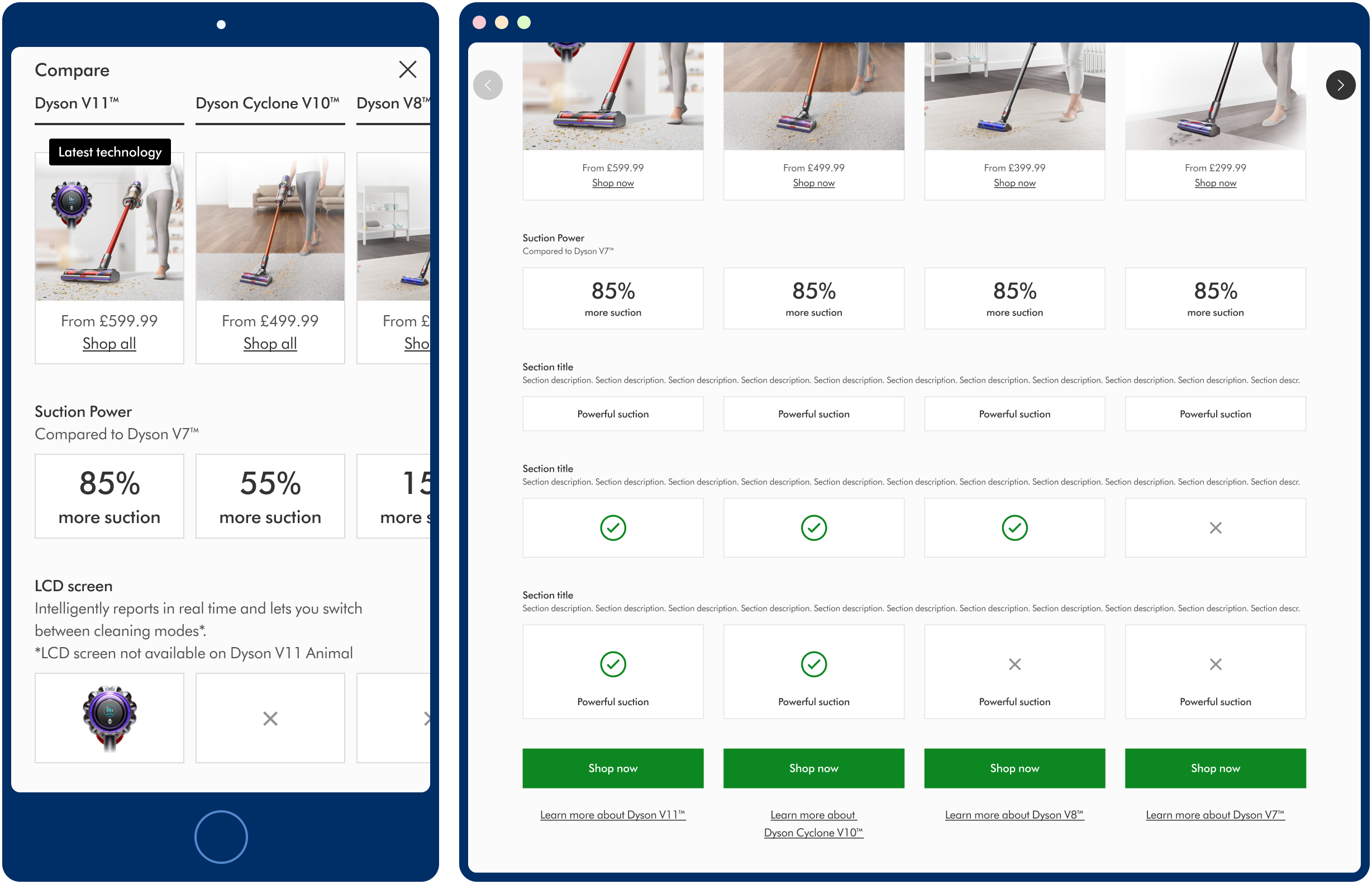
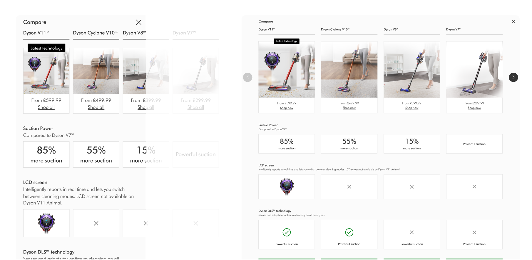
User feedback showed that some users were finding it difficult to compare between Dyson vacuums. After a period of deeper research into user behaviours, another product team identified one output as being a simple comparison table so that users could compare side-by-side.
Our product team was tasked with refining the UI and creating a CMS component ready for our global content teams to add to the live site.
Solution
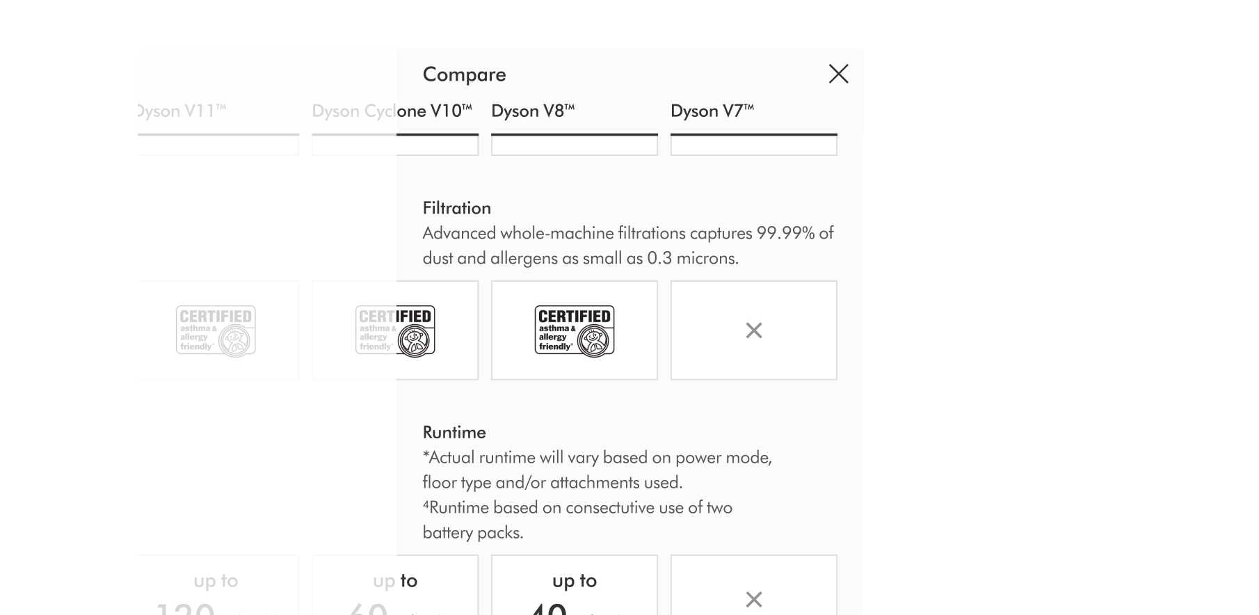
CMS-driven compnent allowing authors to create responsive comparison tables for any product.
Mobile-first, and able to be added to any page on the site for further usability and A/B testing.
Accessible to WCAG 2.1 (AA)
See the final design


