- UI Design
- Journey maps
- Wireframes
- Usability testing
- Interaction Design
- Developer collaboration


High completion rate - users could complete the tool and receive a recommendation in under a minute.
Double the conversion rate of a non-personalised product.
Positive internal feedback - our cross-functional team won internal awards for this piece of work.
Scalable and flexible - We built the CMS component to be reusable for future cross-category products.

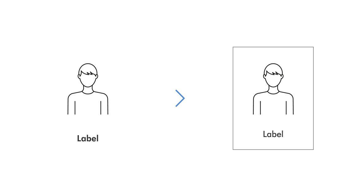
The original UI for the selector elements was unboxed, but I felt the clickability could be improved. I proposed some design options to my team during a design critique, and we decided to run a quick user test to see which design users were faster to interact with. The grouped design won, suggesting that it felt more immediately clickable to users.

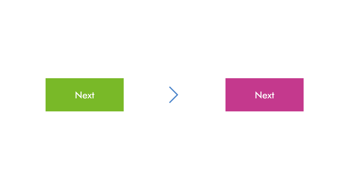
Traditionally, Dyson’s primary progression buttons on web were green, but the version launched in Retail stores was already fuchsia, which matched the product. We ran a couple of short usability test during UI refinement to see which aided progression, but participants in both studies seemed to progress at a similar pace. So once we launched, we ran an A/B test with live traffic, and learned pretty quickly that the fuchsia button aided progression.

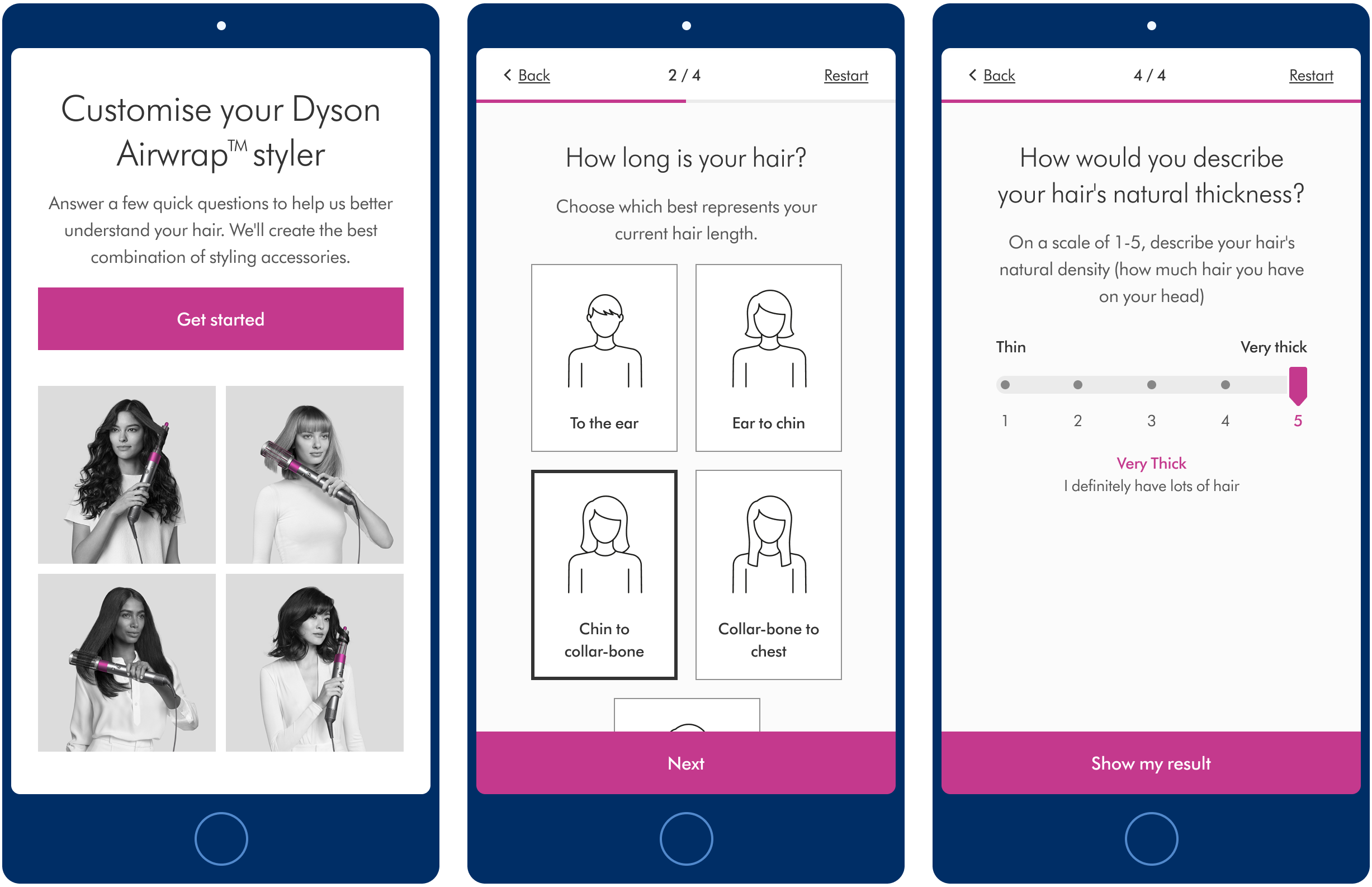
In the retail version, selecting an answer would automatically move the user onto the next question, to aid speed of progression. However after refining the logic, we had three answer types - single selection, range/scale selection and multi-select. There was no way of knowing when a user had finished multi-select question, therefore we would need to provide a ‘confirm’ button to progress. As a result, we decided to enable the ‘Confirm/next’ button on all screens for consistency.